






Background
The previous version was more of a collection of flyers than a true guide. It lacked structure, didn’t follow a clear narrative, and left members piecing together important plan information on their own.
My Role
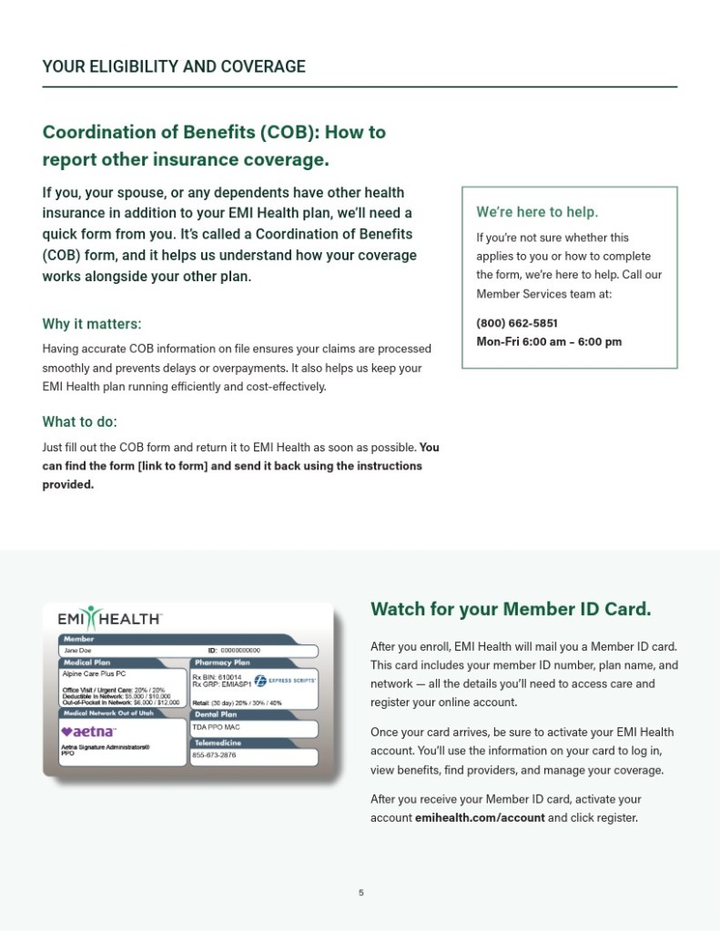
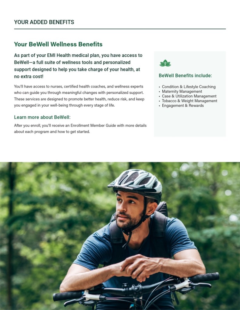
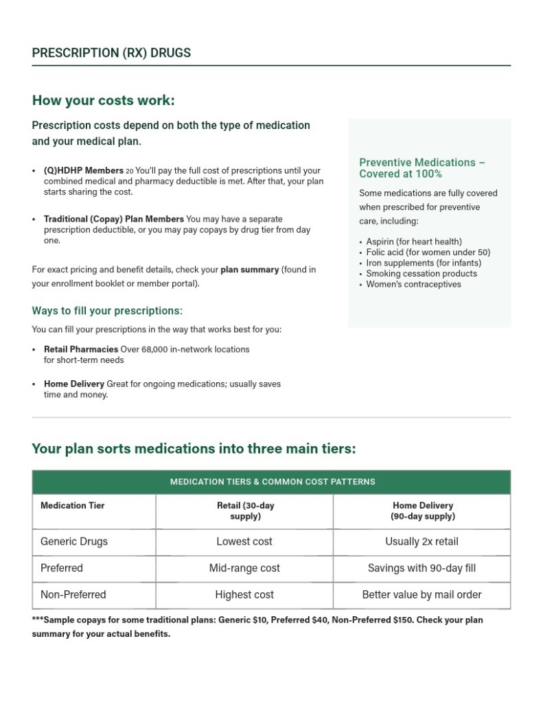
I redesigned the full 20+ page layout. Focused on visual hierarchy, spacing, and structure to create a more intuitive experience. Each section now serves a clear purpose, with consistent formatting and improved pacing. I also contributed layout and design feedback on a newly created website for the school district, ensuring the print and digital experiences worked together.